Inspired by Design: How Bahn-Futura Typeface Fuels Business Creativity and Strategy
The Hauptbahnhof sign, with its iconic font, has captivated my heart. As a designer, I am completely enthralled by the harmonious sign language presented by Deutsche Bahn. Even though I’ve transitioned more towards management assignments and away from regular design production, the sight of this sign instantly transports me back to my creative roots. Its irresistible energy rekindles my intrinsic passion for design. With some quarterly reports to manage soon, I’m considering drawing upon this Futura inspiration.
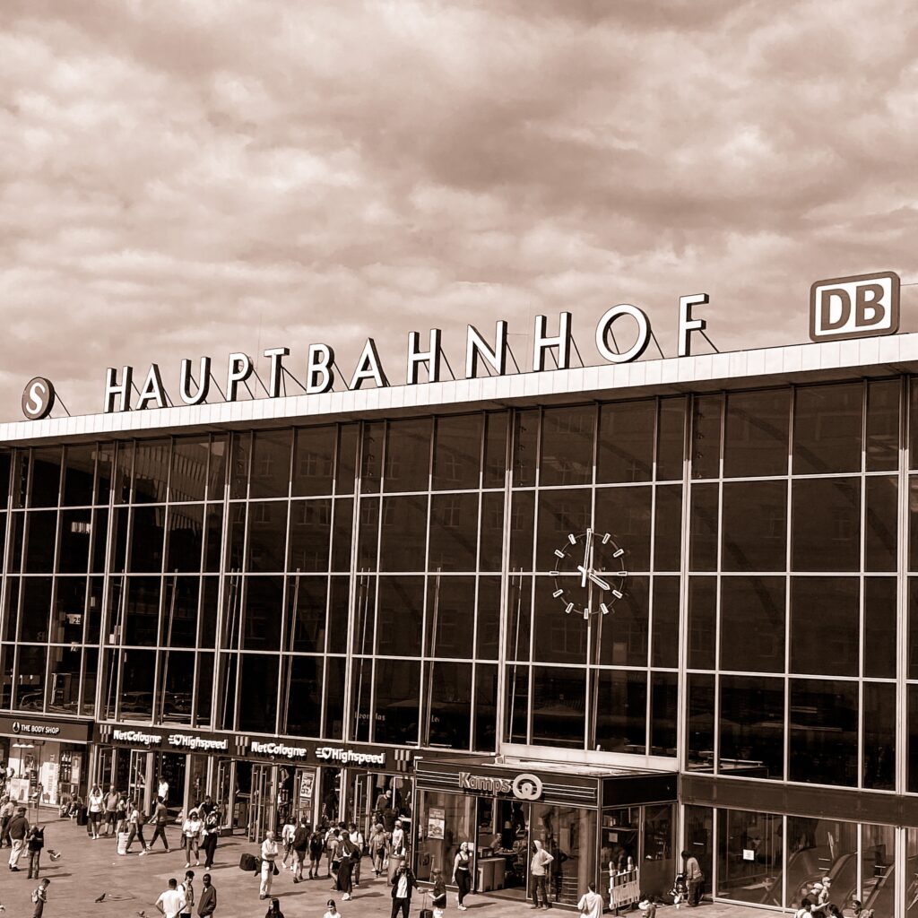
Bahn-Futura, also known as Bahnhofsfutura, is a geometric variant of Paul Renner’s 1927 Futura typeface, designed by Theodor Dierksmeier in the mid-20th century. These hand-painted signs, crafted between 1956 and 1988, often display subtle differences from their original templates, yet they remain a defining characteristic of German railway stations.